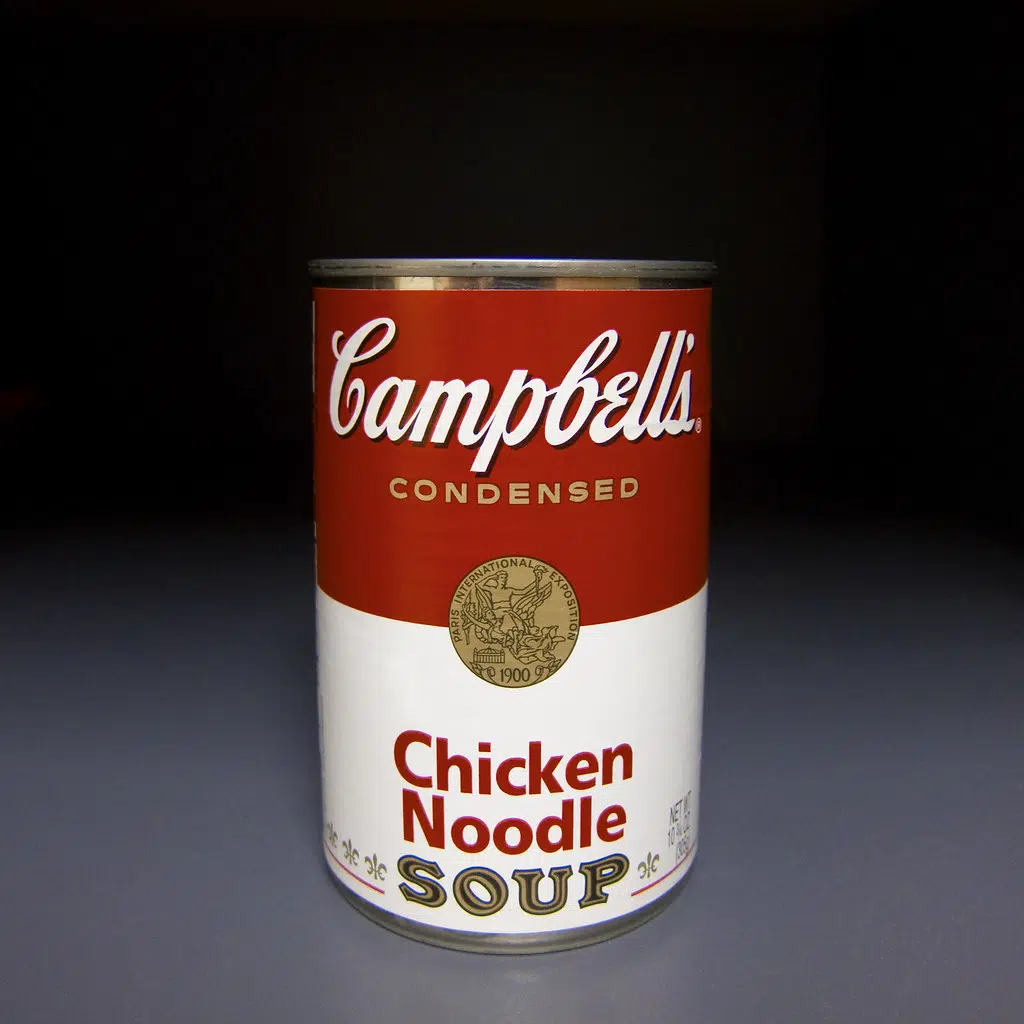
A staple and an icon of the grocery store is going to look a little bit different. The labels on the iconic Campbell’s soup cans are getting their first redesign in five decades.
The red and white base of the design will remain, but the logo is getting an upgrade, and so is the script, and a few other details of the well familiar can. Some of the changes are going to harken back to the original 1898 design and they are slightly changing its font based on founder Joseph Campbell’s original signature.
New label, same M'm! M'm! Good!® taste you know and love.❤️Look for our new design on shelves & online!#NewLook #Campbells #MmMmGood pic.twitter.com/h1tb6FRJrJ
— Campbell's (@Campbells) July 27, 2021


Comments